The TradeAdapt Difference
- Adapts to Market Structure in Real-Time
- Multi-Timeframe Confirmation System
- Professional Dashboard Monitoring
- Used by Institutions Worldwide
🎥 Watch the Video Breakdown
See how Multi-Timeframe Adaptive Fibonacci works in real-time
What Makes This Different
You’ve seen plenty of indicators and systems. Here’s why this one matters.
It’s Not Predictive – It’s Reactive
Most trading systems try to predict what will happen next. This system doesn’t predict anything. It observes structure, calculates adaptive levels based on that structure, and shows you when alignment exists or doesn’t exist.
You’re not guessing. You’re reading what’s already there.
It Adapts to Market Structure
Traditional Fibonacci tools draw levels from historical swing points and leave them static. Those levels get stale as market structure evolves.
Adaptive Fib recalculates continuously as new ranges form. When price breaks out of old structure and establishes new structure, the levels adjust. You’re always seeing current structure, not yesterday’s structure.
It Provides Multi-Timeframe Context
Most traders look at one timeframe and make decisions. Professional traders look at multiple timeframes and wait for confirmation.
This system gives you Monthly, Weekly, and Daily structure on a single chart. You can see if timeframes agree or conflict. When they agree, you have an edge. When they conflict, you have confusion – avoid it.
It Shows You What Institutions See
Fibonacci levels aren’t magic – they’re mathematics. And institutional trading desks, algorithmic systems, and professional traders all use Fibonacci extensions to mark key levels.
When you use the same mathematical framework they use, you see where their orders cluster. You see where they’ll defend levels or attack them. You see the battleground before the battle starts.
It Works Across All Markets
This isn’t an ES-only system or a forex-only system. It’s a structure-based framework that applies to anything with price and volume:
- Futures (ES, NQ, YM, RTY, CL, GC, etc.)
- Forex (EURUSD, GBPJPY, AUDUSD, etc.)
- Crypto (BTCUSD, ETHUSD, etc.)
- Stocks (AAPL, TSLA, NVDA, etc.)
- Commodities (Gold, Silver, Oil, etc.)
Learn it once, apply it everywhere.
How It Works: A Real Market Example
Let’s walk through an actual NQ futures setup that demonstrates exactly how multi-timeframe adaptive Fibonacci levels work in real market conditions. Not theory. Not backtests. Real structure, real levels, real execution.
Chapter 1: The Loong Term View
Every great trade starts with understanding what’s happening right now. No guessing. Just reading the levels.
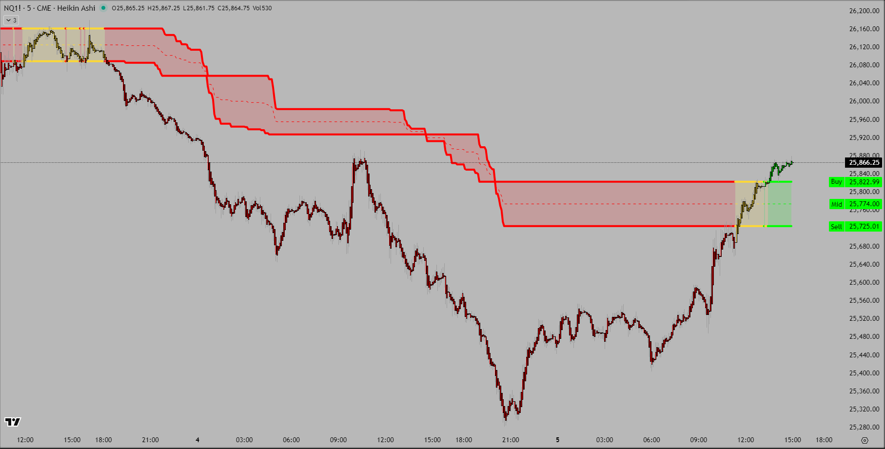
NQ Weekly chart showing basic Buy and Sell levels (click to enlarge)
What You’re Seeing
This is a 5-minute chart of NQ futures with the Weekly Adaptive Fib Buy and Sell lines plotted. This is the power of the system – you’re seeing Weekly structure (where big money operates) displayed on a 5-minute execution timeframe (where you take trades).
The two red horizontal lines represent:
- Weekly Buy (Top Line): Bulls must hold above this level. Break above = weekly bullish structure confirmed.
- Weekly Sell (Bottom Line): Bears must break below this level. Break below = weekly bearish structure confirmed.
The Clean Setup
This minimalist view shows only what matters most – the Weekly Buy and Sell levels. No clutter, no noise, just the two critical lines that define the weekly battleground.
Price action between these lines is neutral territory. Above the Buy line is bullish structure. Below the Sell line is bearish structure. The beauty of this setup is its simplicity – you instantly know where you are in the weekly structure while watching price tick by tick on the 5-minute bars.
Chapter 2: Targets
The market doesn’t just fall randomly. It moves to specific levels where liquidity concentrates.
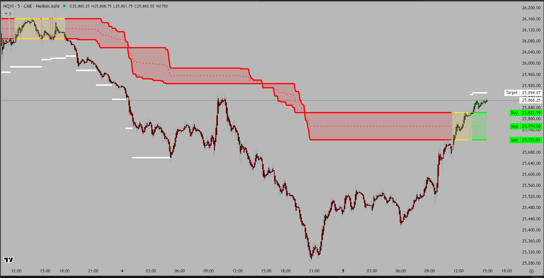
Weekly chart with Buy, Sell, Mid, and Target levels visible (click to enlarge)
Adding the Targets
This is the same 5-minute chart, same Weekly Adaptive Fib structure, but now with additional target levels displayed. Notice the white labels appearing – these show the Mid line (center point between Buy and Sell) and various Target levels that activate as structure evolves.
The horizontal white lines represent Fibonacci-based targets calculated from the weekly range. These aren’t arbitrary – they mark mathematical extensions where institutions commonly place orders and where price naturally tends to pause or reverse.
Why Targets Matter
Targets aren’t arbitrary. They’re derived from the mathematical relationship between the current range and historical Fibonacci ratios. Here’s what makes them powerful:
- Institutional Recognition: Trading desks worldwide use Fibonacci extensions. When a level is widely watched, it becomes self-fulfilling.
- Liquidity Zones: Targets mark where large orders cluster. Market makers, algorithmic traders, and fund managers all reference the same math.
- Risk Management: These levels give you objective points to scale out, add to positions, or tighten stops.
Chapter 3: Expansion Zone – The Critical Moment
This is where everything changed. The moment that separated a routine trading day from a major setup opportunity.
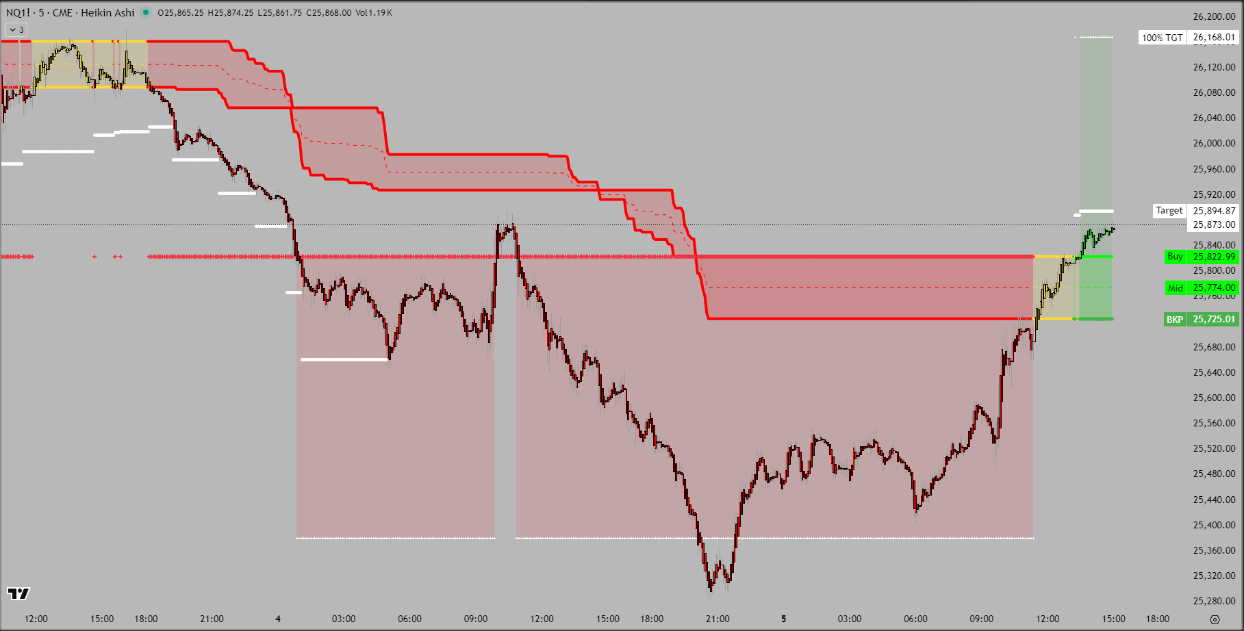
Weekly chart showing complete structure: Buy, Sell, Mid, Targets, and Expansion Points with 100% targets (click to enlarge)
The Expansion Point Level
Now the chart displays the full adaptive structure including Expansion Points – the dashed lines showing Expansion start and target. These are the expansion zones where moves either accelerate or exhaust.
When price reaches an Expansion Point, one of two things happens:
- Continuation: Price pushes through with conviction, confirming the move has legs for the full target extension.
- Reversal: Price finds support/resistance and bounces hard, indicating the move is exhausted.
What’s Displayed
Look at the complete structure now visible on this 5-minute chart with Weekly Adaptive Fib:
- Weekly Buy/Sell: The main structural levels (solid lines)
- Mid Line:
- Targets: Intermediate reference levels
- Expansion Points: The expansion zones and target(dashed lines)
The 100% Target
The 100% Expansion Point represents the full measured move. If price reaches this level with time remaining in the weekly period, probability strongly favors continuation through the week’s end. This is because momentum that carries price to 100% typically doesn’t just stop – it keeps pushing as more participants pile in.
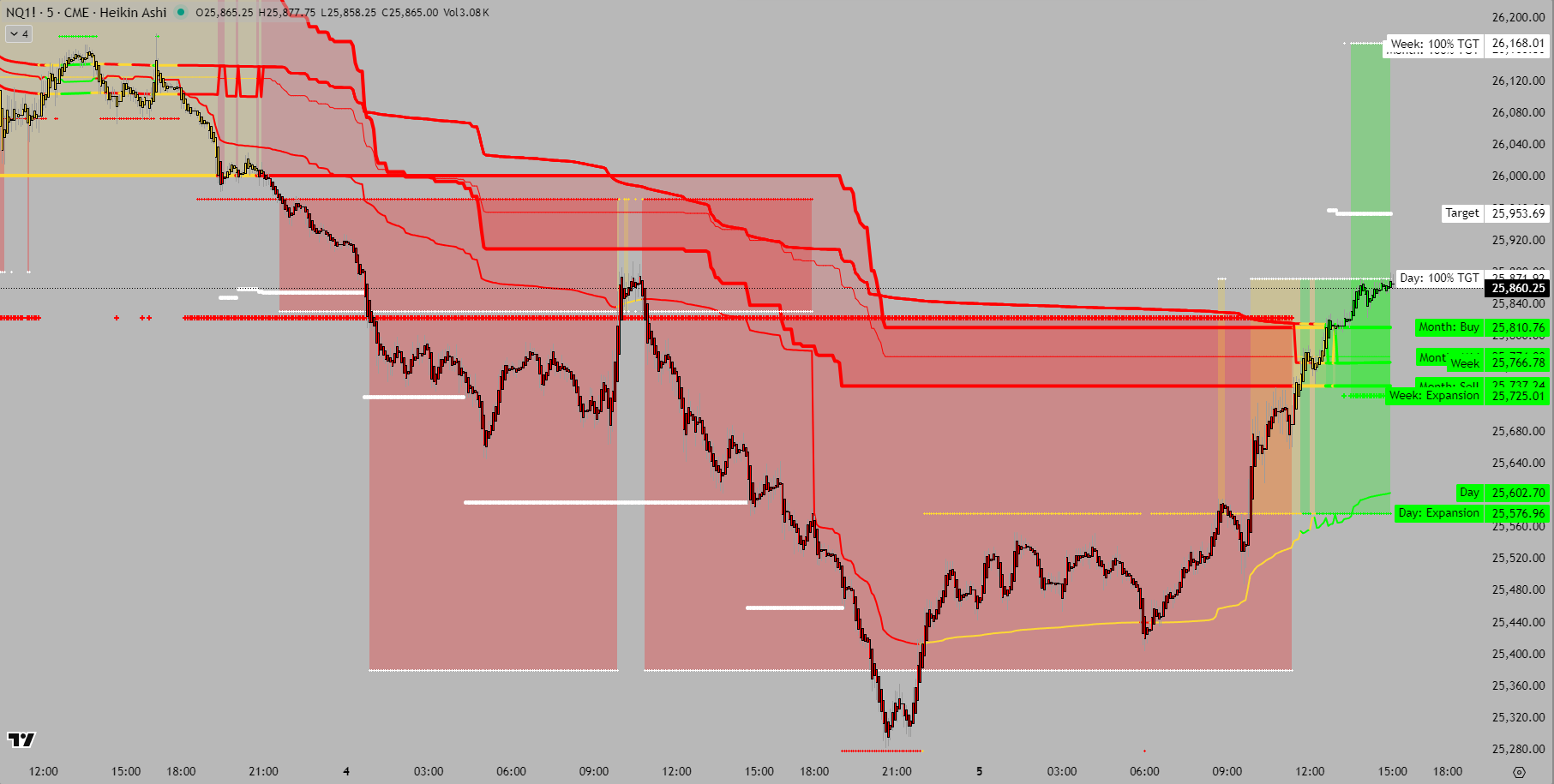
Chapter 4: The Daily View
This is where structure flips. Where bears lose control and bulls take over.
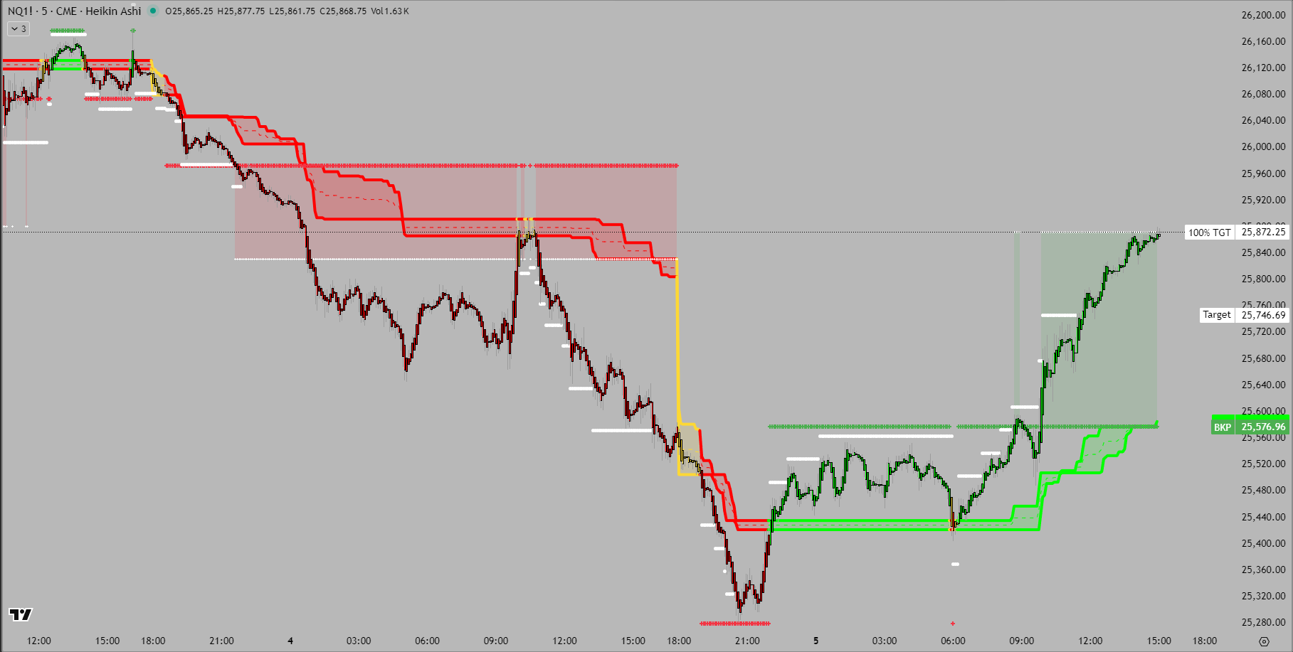
Daily timeframe view showing complete adaptive structure with all levels (click to enlarge)
The Color Shift
This chart tells the complete story. On the left side, you see the red bearish zones from the initial breakdown. On the right side, green zones are emerging as price rallies aggressively.
Look at the right side labels:
- 100% TGT 25,872.25 – The bullish extension target (white label)
- Target 25,746.69 – Intermediate target level
- Expansion 25,576.96 – The new bullish breakpoint (green dashed line)
These aren’t the same targets as before. The system adapted. When price broke above the Monthly Sell level and held, the entire structure recalculated. New bullish ranges formed. New targets generated. This is what “adaptive” means – the levels move with market structure, not against it.
Reading the Transition
The most powerful part of this chart is the middle section – the transition zone. You can see where red zones meet green zones. This is the battleground where control changed hands.
Notice how price didn’t just jump from bottom to top. It climbed methodically through each level:
- Bounced from the BKP expansion low (around 25,300)
- Broke back above the Monthly Sell level (25,725)
- Reclaimed the Monthly Mid zone (around 25,780)
- Pushed toward the Monthly Buy level (25,822+)
Chapter 5: Full Timeframe Alignment
This is the confirmation. When all timeframes agree, probability shifts dramatically in your favor. The key is starting with the Monthly timeframe to establish the macro structure, then layering on Weekly and Daily to reduce noise and confirm alignment.
All three timeframes (Daily, Weekly, Monthly) combined showing complete adaptive structure (click to enlarge)
The Multi-Timeframe Approach
This chart displays all three timeframes simultaneously – Monthly, Weekly, and Daily Adaptive Fib levels plotted together on the same 5-minute execution chart. But here’s the critical insight: you start with Monthly to see where big institutional money is positioned, then use Weekly and Daily to filter out the noise and time your entries.
Why this order matters:
- Monthly first: Shows long-term structure where institutions operate (big picture)
- Weekly second: Filters out daily noise, shows intermediate trend (medium picture)
- Daily last: Provides execution timing within established structure (small picture)
What Full Alignment Means
When Monthly, Weekly, and Daily timeframes all show the same directional bias, you have the highest probability setup possible. This isn’t a 55% edge – this is 70-80%+ probability that the move continues.
Why? Because you have three independent confirmations:
- Monthly: Long-term structural trend (big money positioning)
- Weekly: Intermediate trend confirmation (institutional flow)
- Daily: Short-term execution trend (active trading)
When all three agree, there’s no timeframe fighting the move. Everything is pushing in the same direction.
Chapter 6: Introducing the Market Dashboard
The Market dashboard displays the same information, but was designed for cross-market visibility of individual market structures.
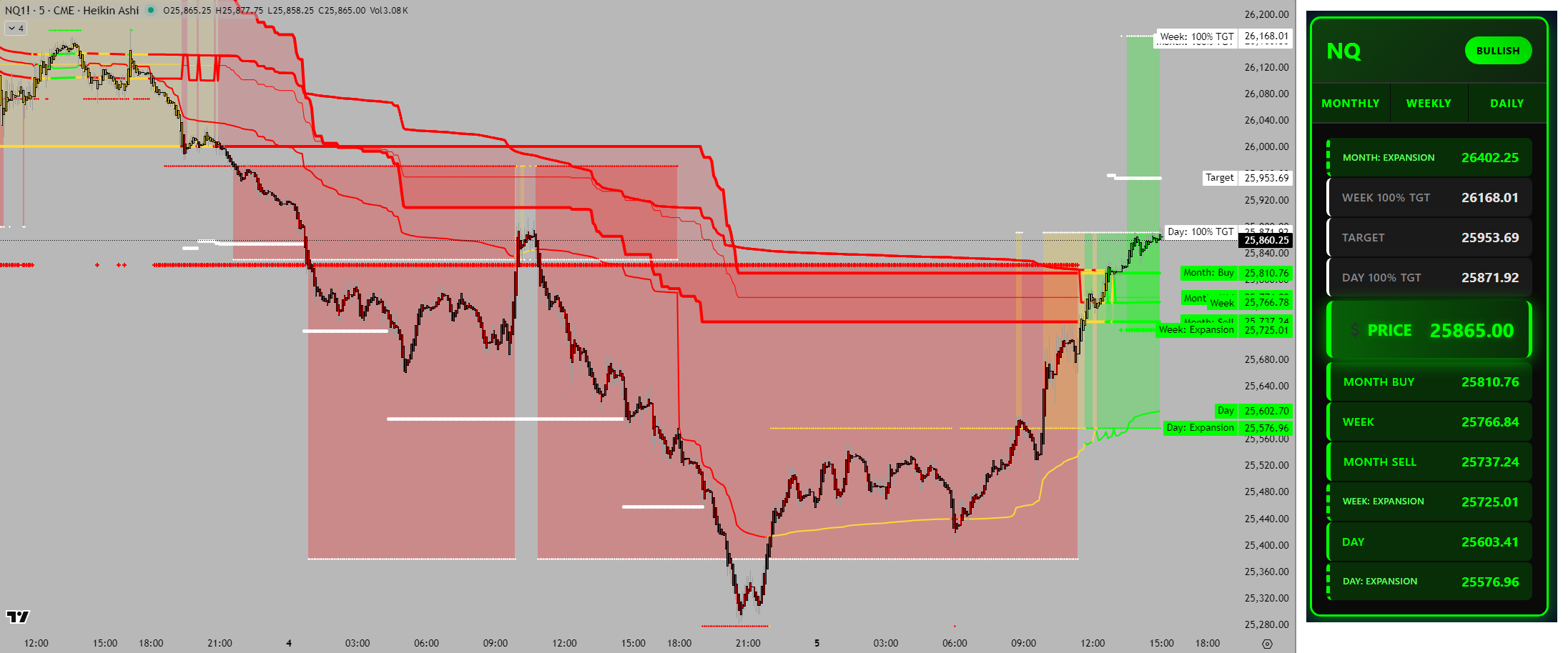
Multi-timeframe chart with real-time dashboard showing NQ alignment and price stack (click to enlarge)
Two Views, Same Levels
On the left: the 5-minute chart with Monthly, Weekly, and Daily Adaptive Fib levels plotted – all the lines, zones, and targets we’ve discussed.
On the right: the dashboard card showing the exact same information, just organized differently. The levels you see drawn on the chart are the same levels listed in the dashboard price stack.
Why Both Views Matter
The chart shows you WHERE price is in relation to structure visually. You can see the zones, watch price approach levels, and observe reactions in real-time.
The dashboard shows you WHAT the current structure is numerically. You get exact prices for every level, timeframe alignment status, and instant confirmation of market state.
Together, they provide complete situational awareness. Chart for visual context, dashboard for precise values and alignment confirmation. This is how professional traders monitor markets – multiple views of the same structure.
Chapter 7: The Dashboard Card Explained
Let’s break down what the dashboard card actually shows and how to read it.
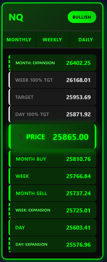
Detailed NQ dashboard card showing timeframe status, alignment badge, and complete price stack (click to enlarge)
This is the real-time dashboard card for NQ. Everything you need to know at a glance:
Top Header:
- NQ – Market symbol
- BULLISH – Alignment badge (green = all timeframes aligned bullish)
Timeframe Status Bar:
- MONTHLY – Green (bullish)
- WEEKLY – Green (bullish)
- DAILY – Green (bullish)
Price Stack (Top to Bottom):
- MONTH: EXPANSION – 26402.25 (green dashed border = active bullish expansion)
- WEEK 100% TGT – 26168.01 (target level)
- TARGET – 25953.69 (intermediate target)
- DAY 100% TGT – 25871.92 (daily target)
- 💲 PRICE – 25865.00 (current market price in large green box)
- MONTH BUY – 25810.76 (monthly bullish level)
- WEEK – 25766.84 (weekly level)
- MONTH SELL – 25737.24 (monthly level, now support)
- WEEK: EXPANSION – 25725.01 (weekly expansion level)
- DAY – 25603.41 (daily level)
- DAY: EXPANSION – 25576.96 (daily expansion level)
Reading the Stack
The price stack is sorted from highest to lowest value. Current price (25865.00) sits in the middle. Everything above is resistance/targets. Everything below is support.
Notice the color coding:
- Green solid border = Bullish levels (Month Buy, Week, Day)
- Green dashed border = Expansion levels (BKP zones)
- White/gray = Targets (neutral projection levels)
Chapter 8: Multi-Market Confirmation
The ultimate confirmation: when all major indices align together.
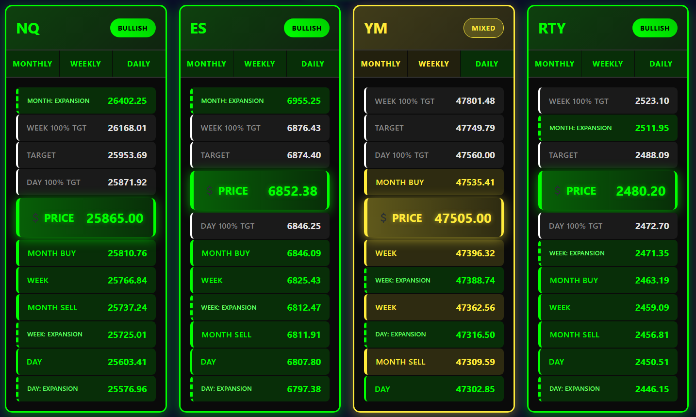
Complete dashboard showing NQ, ES, YM, and RTY with coordinated bullish structure across major indices (click to enlarge)
The Power of Correlation
This dashboard shows four major equity index futures side by side:
NQ (Nasdaq-100):
- Badge: BULLISH (green)
- All three timeframes: Green
- Price: 25865.00
ES (S&P 500):
- Badge: BULLISH (green)
- All three timeframes: Green
- Price: 6852.38
YM (Dow Jones):
- Badge: MIXED (yellow)
- Monthly/Weekly: Yellow (neutral/mixed)
- Daily: Green (bullish)
- Price: 47505.00
RTY (Russell 2000):
- Badge: BULLISH (green)
- All three timeframes: Green
- Price: 2480.20
What This Tells Us
Three out of four major indices showing full bullish alignment is extremely powerful. The only laggard is YM (Dow), which is MIXED – but even its Daily timeframe is bullish.
This broad market confirmation means:
- Institutional Consensus: Big money is buying across the board, not just one index
- Lower Risk: When multiple correlated markets align, reversals are less likely
- Momentum Confirmation: The move has breadth – not just one sector leading
- Higher Probability: Divergences often signal trouble; convergence signals strength
Global Market Confirmation
But it doesn’t stop with US equity indices. When a move has real institutional conviction, you’ll see it across global markets too.
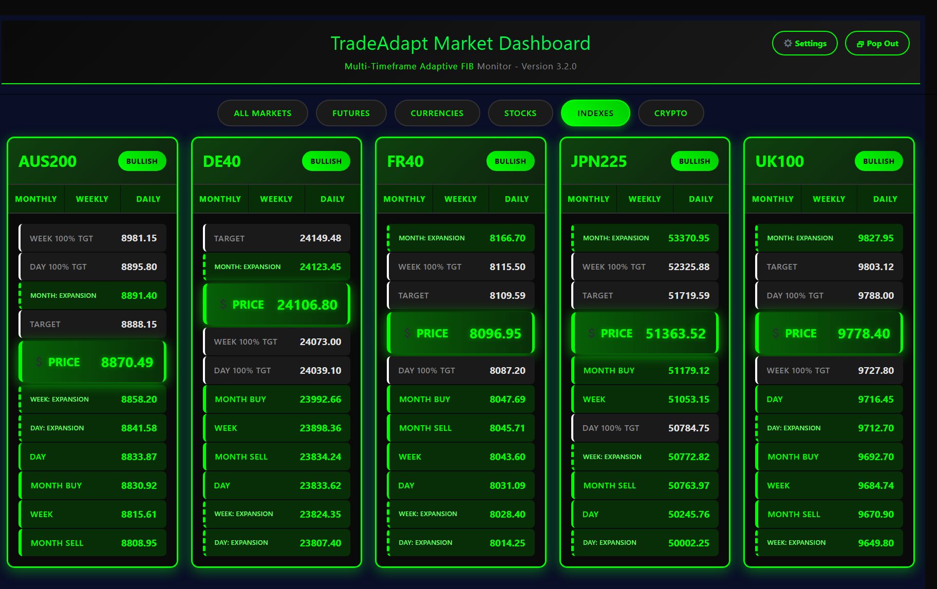
Global index dashboard showing AUS200, DE40, FR40, JPN225, UK100 – international confirmation of the bullish structure (click to enlarge)
This dashboard shows major international equity indices:
- AUS200 (Australia): S&P/ASX 200
- DE40 (Germany): DAX 40
- FR40 (France): CAC 40
- JPN225 (Japan): Nikkei 225
- UK100 (United Kingdom): FTSE 100
When you see alignment not just across US indices (NQ, ES, RTY, YM) but also across major global indices, you have ultimate confirmation. This isn’t just a US equity move – this is global institutional capital flowing in the same direction.
The Complete Trade Breakdown
Let’s put all the pieces together and see what actually happened.
Timeline of the Move
Phase 1: The Breakdown
- NQ breaks below Monthly Sell level (~25,825)
- All three timeframes turn bearish (red)
- Market selling off hard, hitting expansion targets
- Correct play: Stay short or flat, respect the red alignment
Phase 2: The Inflection
- Price reaches Monthly Expansion target (BKP ~25,725)
- Instead of breaking through, price holds and consolidates
- First sign of exhaustion in the bearish move
- Correct play: Watch for reversal signals, tighten shorts or exit
Phase 3: The Reversal
- Price breaks back above Monthly Sell level
- Daily timeframe flips green first
- Weekly timeframe confirms green
- Monthly timeframe confirms green
- Green zones emerge, replacing red zones
- Correct play: Enter long as structure confirms, each timeframe flip adds conviction
Phase 4: The Climb
- Price grinds higher through each level
- Former resistance becomes support
- Each dip gets bought, confirming strong hands
- Dashboard shows full BULLISH alignment
- Correct play: Hold longs, add on dips to key support levels
Phase 5: Multi-Market Confirmation
- ES also shows BULLISH alignment
- RTY also shows BULLISH alignment
- YM shows MIXED (lagging but not bearish)
- All major indices participating in the move
- Correct play: Maximum conviction, can size up positions with confidence
The Numbers
Let’s look at the actual point movement:
- Starting Point: ~25,300 (low at expansion target)
- Ending Point: ~25,865 (price at dashboard snapshot)
- Point Move: 565 points
- Percentage Move: 2.23%
But the move didn’t stop at 25,865. Looking at the dashboard targets:
- Next Target: 25,953 (88 points higher)
- Week 100% TGT: 26,168 (303 points higher)
- Month Expansion: 26,402 (537 points higher)
Total Potential Move: From 25,300 low to 26,402 target = 1,102 points
The Key Lessons
What makes this trade instructive isn’t the profit – it’s the process.
Lesson 1: Respect the Timeframe Alignment
When all three timeframes show red, don’t try to catch falling knives. Wait for structure to flip. The system showed bearish – that was the correct read. Only when green zones started appearing did the long opportunity materialize.
Lesson 2: Expansion Targets Are Reversal Zones
The BKP level (50% expansion) is where moves often exhaust or accelerate. When price hit the Monthly Expansion and held instead of breaking through, that was the signal that sellers were done. This is repeatable – watch for price behavior at expansion zones.
Lesson 3: Structure Reclaiming Is Confirmation
The reversal didn’t happen all at once. Price methodically reclaimed each level – Monthly Sell, Monthly Mid, Monthly Buy. Each level that held as support added confidence. Don’t chase the initial bounce – wait for structure confirmation.
Lesson 4: Multi-Market Context Matters
NQ alone showing bullish is one thing. NQ, ES, and RTY all showing bullish is another level entirely. The dashboard view gave instant confirmation that this wasn’t just one market – it was the entire equity complex moving together. That’s when you size up.
Lesson 5: Adaptive Levels Beat Static Levels
Traditional Fibonacci tools draw fixed lines from swing highs/lows. Those lines don’t move. Adaptive FIB recalculates as structure evolves. When price broke above Monthly Sell and established new bullish structure, the entire level system adjusted. You weren’t looking at yesterday’s structure – you were seeing today’s structure in real-time.
How to Trade This in Your Account
Theory is great. Execution is what pays the bills.
The Setup Checklist
Before entering any trade based on this system, confirm:
- Dashboard shows alignment: All three timeframes same color (green or red)
- Price is through key level: Above Monthly Buy for longs, below Monthly Sell for shorts
- Expansion zone cleared or holding: If at BKP, wait for confirmation of direction
- Multi-market confirmation: Check correlated markets (ES, NQ, RTY, YM)
- Clean price structure: No chop, no wicks through levels, clean reclaiming
Entry Strategies
Aggressive Entry (Higher Risk, Earlier Entry):
- Enter when first timeframe flips (e.g., Daily goes green)
- Use tight stop below the level that just flipped
- Small position size, plan to add if other timeframes confirm
Conservative Entry (Lower Risk, Later Entry):
- Wait for all three timeframes to align
- Wait for dashboard to show BULLISH or BEARISH badge
- Enter on pullback to first key support level
- Larger position size, higher confidence setup
Scalper Entry (Quick In/Out):
- Enter at any key level once alignment is established
- Target next level for exit (50-100 points on NQ)
- Very tight stop (below entry level)
- Multiple trades per day as price climbs through levels
Position Management
Scaling Out Strategy:
- Full position at entry (6 contracts example)
- Exit 1 contract at first target level (16.7% off)
- Exit 1 contract at second target level (33.3% off)
- Exit 1 contract at third target level (50% off)
- Let remaining 3 contracts run to final targets
- Trail stop below each reclaimed level
Scaling In Strategy:
- Enter 2 contracts when first timeframe flips
- Add 2 contracts when second timeframe confirms
- Add 2 contracts when third timeframe confirms
- Now at full 6 contract position with highest conviction
Stop Management
Structure-Based Stops (Recommended):
- Place stop below the last key level that held
- For longs: stop below Monthly Sell or Month Buy level
- For shorts: stop above Monthly Buy or Month Sell level
- If level breaks, structure is compromised – exit immediately
Time-Based Stops:
- If structure doesn’t confirm within X bars, exit
- If price hasn’t reached next target within Y hours, reassess
- If timeframe flips back to opposite color, exit regardless of P&L
Common Mistakes to Avoid
Learn from others’ errors. Here’s what NOT to do.
Mistake 1: Fighting the Alignment
Wrong: “All timeframes are red but I think we’re due for a bounce, so I’m going long.”
Right: “All timeframes are red, so I’m staying short or flat until I see green zones appear.”
The system shows you the structure. Respect it. Your opinion doesn’t matter – the levels do.
Mistake 2: Chasing After the Move
Wrong: “Price just ran 400 points and all timeframes flipped green – I’m buying here!”
Right: “Price ran 400 points. I’ll wait for a pullback to key support before entering.”
Don’t FOMO into extended moves. Wait for price to come back to structure.
Mistake 3: Ignoring Multi-Market Context
Wrong: “NQ is bullish so I’m long, I don’t care what ES is doing.”
Right: “NQ is bullish AND ES is bullish AND RTY is bullish – this is a high conviction setup.”
One market can fake you out. Multiple markets agreeing is confirmation.
Mistake 4: Using Fixed Stop-Loss Points
Wrong: “I always use a 50-point stop on NQ regardless of where levels are.”
Right: “My stop is below the Monthly Sell level because that’s where structure breaks.”
Structure-based stops keep you in good trades and get you out of bad ones at the right place.
Mistake 5: Overtrading Mixed Signals
Wrong: “YM is MIXED so I’ll try to scalp both directions.”
Right: “YM is MIXED so I’ll wait for clear alignment before trading it. I’ll trade NQ instead where alignment is clear.”
Mixed means no edge. Trade what’s clear, ignore what’s choppy.
Final Thoughts: From Setup to Execution
This real market example demonstrates structure-based trading.
What You Saw
- 5-minute chart displaying Weekly Adaptive Fib structure
- Layering complexity: Buy/Sell → Targets → Expansion zones
- Daily, Weekly, Monthly timeframes combined
- Price reaching expansion zones and showing reactions
- Full timeframe alignment across Monthly, Weekly, Daily
- Multi-market confirmation with ES, RTY, YM, and global indices
- Dashboard showing real-time alignment status
- Chart + Dashboard integration for complete view
What You Learned
- How to read adaptive Fibonacci levels in real-time
- Why expansion zones are critical inflection points
- How to identify timeframe alignment vs. conflict
- Why starting with Monthly reduces noise on shorter timeframes
- Why multi-market context increases conviction
- How to use dashboard for instant structure assessment
- Where to enter, where to stop, where to target
What To Do Next
- Get the system installed in your platform
- Set up your dashboard for your markets
- Watch structure unfold for 1-2 weeks without trading
- Start paper trading when you see alignment setups
- Track every entry, stop, and exit decision
- Go live with small size once you’re consistent on paper
- Scale up as confidence and results improve
The TradeAdapt Difference
This trade breakdown shows what’s possible when you combine:
- Adaptive levels that move with market structure
- Multi-timeframe analysis showing alignment or conflict
- Real-time dashboard monitoring multiple markets
- Professional framework used by institutions
- Clear entry/exit signals based on structure, not emotion
This is how modern markets work. This is how professionals trade. This is what edge looks like.
Ready to Trade With Structure?
Get the same adaptive levels and dashboard system.
Get TradeAdapt Multi-Adaptive FIB
Limited to 10 new members per week for personalized support
RISK DISCLOSURE & DISCLAIMER
PAST PERFORMANCE IS NOT INDICATIVE OF FUTURE RESULTS
The trading example presented in this case study is a real market occurrence, but it represents market structure analysis and should not be considered typical of all market conditions. Individual trading results will vary significantly based on entry timing, position sizing, risk management, market conditions, and trader skill level.
No representation is being made that any account will or is likely to achieve profits or losses similar to any examples shown. Market conditions vary and structure behaves differently in different environments.
TRADING INVOLVES SUBSTANTIAL RISK
Trading futures, forex, stocks, and other financial instruments involves substantial risk of loss and is not suitable for every investor. The high degree of leverage can work against you as well as for you. Before deciding to trade, you should carefully consider your investment objectives, level of experience, and risk appetite.
THIS IS NOT INVESTMENT ADVICE
This case study is provided for informational and educational purposes only. It is not investment advice, nor is it a recommendation to buy or sell any security or financial instrument. The analysis presented represents one interpretation of market structure and should not be construed as a guaranteed method for profitable trading.
Users are solely responsible for their own trading decisions and should consult with a licensed financial advisor before making any investment decisions.
SYSTEM LIMITATIONS
The TradeAdapt Multi-Adaptive FIB system is a technical analysis tool that identifies structural levels based on Fibonacci mathematics. It does not predict future price movement, guarantee profitable trades, or eliminate trading risk.
Market conditions can change rapidly. Levels that held in the past may break in the future. Timeframe alignment does not guarantee continued price movement in the aligned direction.
HYPOTHETICAL EXECUTION
The trading example describes structure and levels in hindsight. Real-time trading execution is significantly more challenging than post-trade analysis. Factors including slippage, spread, market impact, and emotional decision-making will affect live trading results.
NO WARRANTY
The software, system, and dashboard are provided “as is” without warranty of any kind, either express or implied, including but not limited to warranties of merchantability, fitness for a particular purpose, or non-infringement. TradeAdapt.ai does not warrant that the system will be error-free, uninterrupted, or meet your requirements.
LIMITATION OF LIABILITY
In no event shall TradeAdapt.ai, its owners, employees, or affiliates be liable for any direct, indirect, incidental, special, or consequential damages arising out of or in connection with the use of this system, even if advised of the possibility of such damages. This includes, but is not limited to, trading losses, lost profits, or business interruption.
By using the TradeAdapt system or following any analysis presented on this page, you acknowledge that you have read, understood, and agree to this disclaimer and risk disclosure. You further acknowledge that trading decisions are your own responsibility and that past examples do not predict future outcomes.
© 2025 TradeAdapt.ai | All Rights Reserved